12 Tips for More Usable Web Forms
By Mike Raia ![]() | Published April 23, 2018
| Published April 23, 2018
Forms that are poorly designed can end up going unused and lead to users finding workarounds (usually circumventing your carefully-designed process). We have some tips for making your forms more user-friendly and, ultimately, used.
Related
Forms are necessary, but they do not have to be a necessary evil. While no one wants to spend their day completing forms, there's a lot we can do when designing form-driven processes to make sure that the experience of completing a form is as frictionless as possible. When process forms are better, the data feeding your processes will be better. Below are some tips and tactics to ensure that your form user experience is positive and you are able to capture the information you need.
Remove all non-essential fields—if you do not need it, don't ask for it.
Before, during, and after form development, ask yourself if every field needs to be there. Will action be taken on the data provided? Does a report require it? If not, decide whether or not you need to include the field. Every field adds time and decreases the odds that the form will be completed. This is not just an issue for lead generation forms either. If someone finds a form too cumbersome even for an internal process, he or she may skirt the process and send an email, pick up the phone, etc. instead.
Make optional questions clearly optional.
One strategy is to simply not make any field optional, especially if you follow the previous tip and don't include extraneous fields. However, if you decide to include an optional field (for instance a "Description" or "Comment" field) make sure to indicate it clearly. Again, the goal here is to ensure a positive user experience and reduce friction. Wasting time on an optional field a user didn't know was optional is extremely frustrating.
Use Pre-Fills
Form design tools like Integrify provide the ability to pre-fill forms with known information. Prefills can be information that was previously entered by the user or information pulled from existing systems. For instance, Integrify allows integration with Active Directory to pull in user information and reduce the need to enter and re-enter basic user information. Pre-filling can also ensure accuracy by removing manual data entry.
Be smart about using color and, for the sake of the color-impaired, never rely on it to communicate.
A percentage of the users of your forms may have a color deficiency of some kind. If you rely on color to indicate a warning, provide direction or emphasis or even show a hyperlink, a percentage of users will not see it. Use symbols and text, don't rely on font colors, and always underline links.
Don't over-size or under-size input fields.
When setting a field width, make sure it correlates to the information to be entered. For instance, if you are looking for a two-digit number, don't use a form field that's 50 pixels wide. This may confuse a user into thinking you are looking for different information. In some cases, a form field (or series of fields) may be set with a percentage and expanded to fill a space, leaving the field out of synch with the information to be provided. Inappropriately-sized fields can be very confusing to the user.
Avoid cutting up fields for things like dates or phone numbers.
Instead of providing, for instance, a series of fields to enter the parts of a phone number, use one field with an input mask. Breaking up a field into multiple inputs can be confusing and leads to users having to retype multiple times as they try to get it right. Even with auto-advancing from field to field, users tend to struggle.

Test forms across all devices and browsers, seriously, do it.
It can be a surprise (and not a good one) to see your forms on mobile devices, in different browsers, or even when a browser window is re-sized. Test all these scenarios before publishing a form. Even though more modern form building tools like Integrify's are designed to be mobile-friendly by default, you should still test and confirm at all sizes.
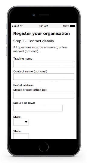
Use multi-step forms to avoid form overload and ALWAYS display a progress bar.
We have had customers build enormous forms with hundreds of fields, and while that may have suited their needs, we would usually push them to break up the form into logical sections and break those sections across multiple pages. Again, the goal is to avoid overwhelming the user with so much information all at once. Providing a progress bar or some other element that lets the user know where they are and what's next is a no-brainer to avoid form fatigue.
Know when to use radio buttons, checkboxes, and dropdowns.
Use the proper "Select" field for the task. According to the Nielsen Norman Group:
- Radio buttons are used when there is a list of two or more options that are mutually exclusive, and the user must select exactly one choice. In other words, clicking a non-selected radio button will deselect whatever other button was previously selected in the list.
- Checkboxes are used when there are lists of options, and the user may select any number of choices, including zero, one, or several. In other words, each checkbox is independent of all other checkboxes in the list, so checking one box does not uncheck the others.
- A stand-alone checkbox is used for a single option that the user can turn on or off.
Using the wrong field type at the wrong time can confuse form users and cause data flow issues later in the process. Read more on the Nielsen Norman Group's Web site.
Put much thought into grouping fields logically and in the proper order.
Layout and field order should be at least partially guided by the way the information is being retrieved from an external system (or paper forms.) For instance, form data could be coming from a CRM system, and the user is glancing back and forth between the CRM system and the form.
Forcing this user to jump around your form to enter values can be a big source of frustration. By grouping and ordering your form fields to mimic the way the CRM screen is set up you can greatly increase data entry speed and reduce user frustration.
Test tabbing between fields and ensure it follows a sequential order.
Some form users will want to use the tab button instead of manually clicking inside of each field. Test the tab order of fields to ensure that it follows the logical progression of the user through the forms. If you hit the tab button and are taken to a field far down the form, you can bet that users will be very frustrated.
Use conditional logic whenever possible to shorten your forms.
If your form designer allows it, you can drastically shorten forms by showing or hiding content based on user entry. Rather than displaying every possible field and presenting an onerous form that will put off users, present a form that adjusts to the user. For instance, on an onboarding form, a user indicates that they will be working in the marketing department. The form then displays a pre-determined list of software that Marketing folks typically need, and they can select from them. This is instead of showing all the possible types of software available in the organization.
Summary
While some of these tips may seem small, in aggregate they can add up to a much more usable and successful form that users will appreciate. Collecting data as part of any process is key and the better the form, the better the data.

Mike Raia
Marketing the world's best workflow automation software and drinking way too much coffee. Connect with me on LinkedIn at https://www.linkedin.com/in/michaelraia/